
Summer of Code is Over
So, with August coming to an end, so does Google Summer of Code 2020. It’s been an awesome journey, and I want to share what I’ve been up to all this time ✨
Below is the final submission text, and the full project timeline
p5.js Web Editor Mobile UI
by @ghalestrilo
The p5.js Web Editor is an important tool in the p5.js ecosystem. Beginners and experts both rely on the tool for prototyping p5.js sketches because of its convenience and accessibility. However, one of its limitations is that it doesn’t work well on small-screen devices, such as smartphones. Perhaps you only have access to a smartphone, or from my personal experience, maybe you have a sketch idea while away from home or you want to show your favorite one to a friend. I wanted to create a version of the web editor that everyone could use comfortably wherever they are. I’m Ghales, and my project for Google Summer of Code ‘20 was to design and implement a mobile user interface for the editor. This required:
- Understanding the UI limitations imposed by low-resolutions
- Detecting common patterns across mobile editors
- Defining the core functionality of the editor
- Studying alternatives for the editor’s UI and functionality solutions
Step 1: Studying UX
I have very limited understanding of UX design, so my first step was studying how to properly develop one. The main takeaway was to first lay out everything the editor can do, then understand the different user journeys within it and then try different possibilities. We chose the designs that made the most frequent and important features the easiest to find. From there, we made a few wireframes, which we turned into prototypes, and then had users test them. With the gathered feedback, we iterated on the design a few times.
Researching how other mobile editors organize functionality also helped a lot when thinking of where to place elements in the design, because many problems already have well-tested solutions. For example, creating a bottom bar with editor actions that are used often and easy to reach with a user’s thumb, or having the project and filename in the header so it’s clear to a user what they are working on.
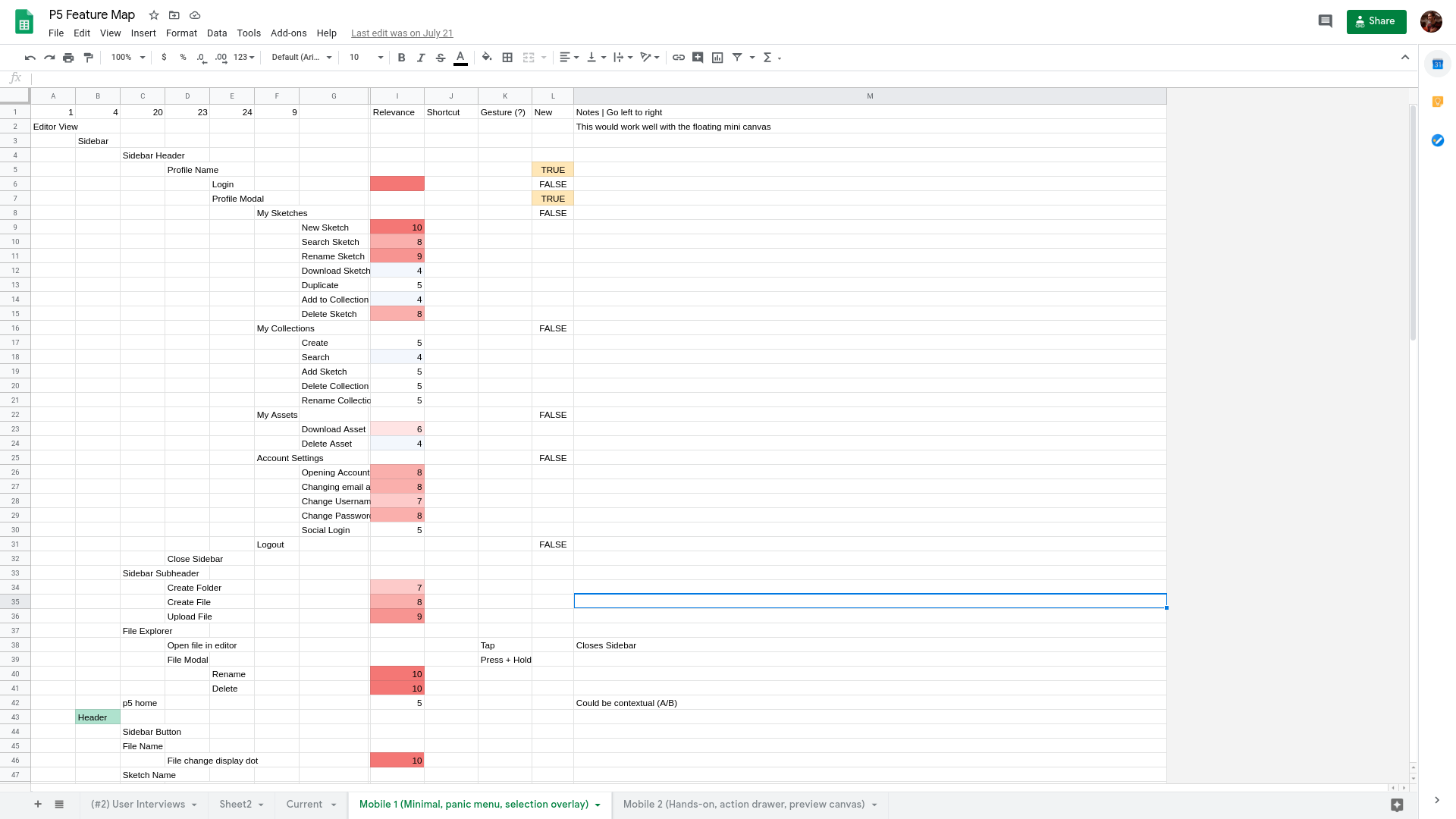
Step 2: Feature Mapping
The next phase of work was mapping out what the current editor does onto a spreadsheet, creating what is called a feature map. When looking at the map, notice how the UI is described in a tree structure, where the further from the root, the more clicks a functionality takes. The most urgent ones need to be as left as possible, near the user.
Step 3: Prototyping
Once the feature map was done, it was time to draw some screens. We created a Figma project and followed the feature map when putting things in place. Below is the glorious first draft:
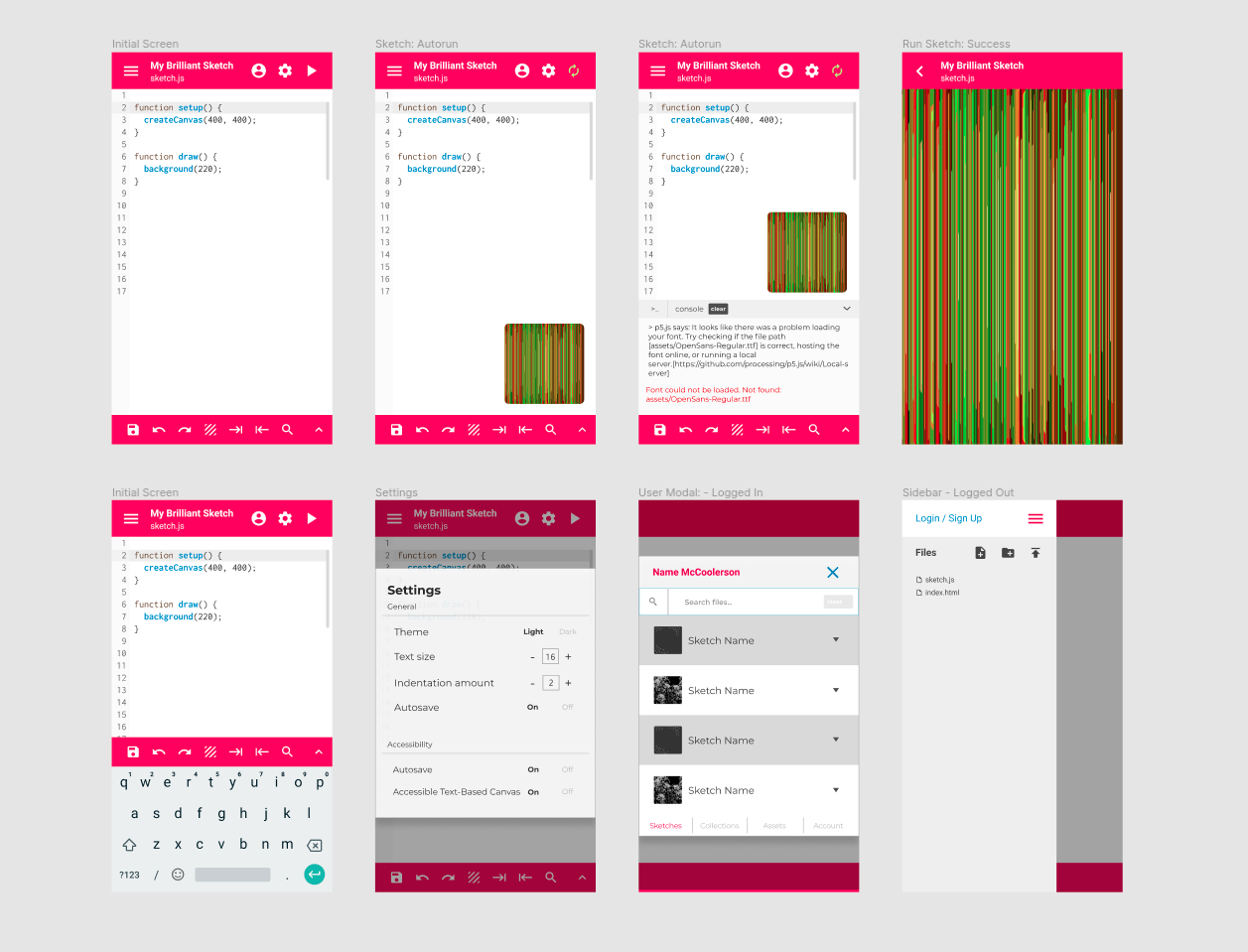
This phase involved getting a lot of feedback both from users and my mentor, Cassie Tarakajian (@catarak), who helped me a ton throughout the process (thank you!). Cassie pointed to the importance of accessibility, and that we made sure the app was WCAG-compliant, in both code and layout. Among other things, that means no white on pink text, because it’s hard to read.
Despite many questionable design choices here, some things did hit the spot: the floating canvas was generally appreciated, and the buttons and screen navigation were overall intuitive, which was a huge win. After a lot of back-and-forth with users, these were the final layout proposals:
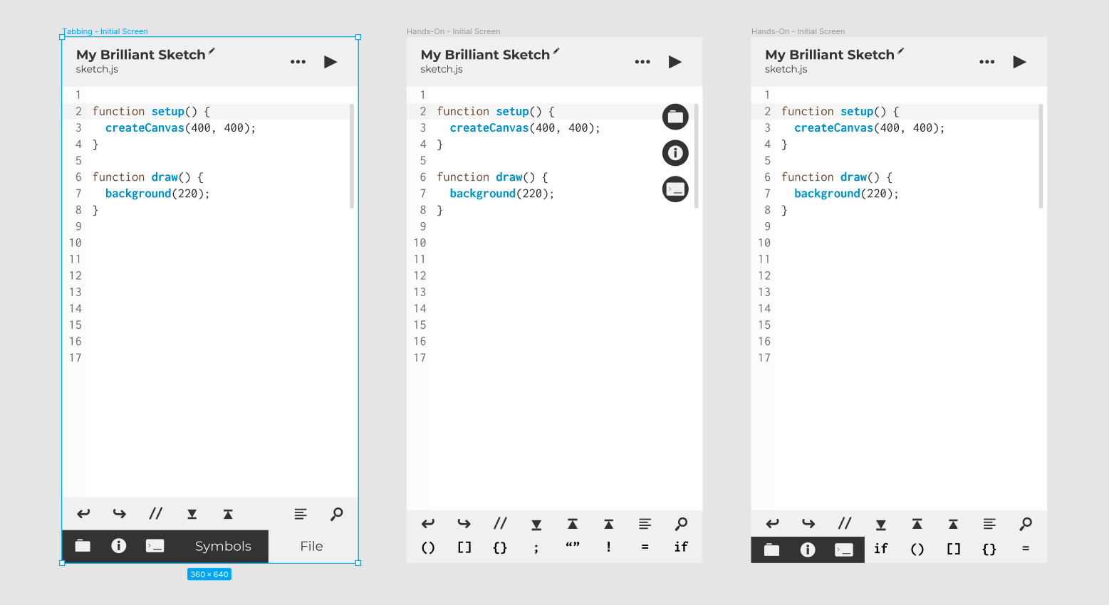
They’re mostly the same, except for the bottom bar, and the position of the navigation icons. That said, our direction will be somewhere between the third and the second. Some lessons learned:
- It’s hard to create a clear distinction between file-level actions and IDE navigation actions.
- These are probably the most common operations: undo, redo, toggle comment, copy line down/up, prettify code and find text
Step 4: Coding!
With a researched and tested design, it was time to start coding. I knew I wasn’t going to implement the whole design, given that this is a summer project, but I was excited to complete as much as possible.
Some key points here:
- Some core code will be the same regardless of the final design we decide on. This allowed me to get some stuff out of the way as I ran the user tests. Mainly, creating an endpoint for testing, and making the first screens - IDE, Sketch and Preferences came first because they were mostly the same across all proposals.
- Most of the time, I was working on a completely isolated environment (a different URL endpoint altogether), where I could code without interfering with the main editor code. This choice sped up the process quite a bit, as it minimized conflicts from parallel development.
- It’s important to spend as little time as possible on a single branch, and to deliver small, easily integrated changes to the main branch. This enables reviews to be faster and more thorough, avoiding throttling and improving code quality.
After another design iteration, I come back to finish placing the core features:
- Adding the Console to the Mobile Editor
- Adding a Dropdown menu to the Header, for navigation
- Adding the Examples / My Stuff Screen to mobile (this was a big one, there were many different screens and use cases to take into account)
To close the project, the editor had to detect automatically if it’s being run on mobile, and choose the appropriate view. This is crucial for the user, otherwise the project missed the point completely. For this, we used a media query from react-responsive and merged the mobile and desktop endpoints.
Conclusion
I was able to deliver more than I set out to at the beginning of the summer!. My focus was to create a design plan and an implementation roadmap. At first we were skeptical that working, production code could be deployed by the end of summer, and that a product could be available for users to interact with, but with a little more testing it will be ready!.
It was my first contribution to open-source, and I learned a lot with it: doing many things I’m not used to, facing new challenges and developing new abilities. If approved by the community, this constitutes a nice milestone for the project (and for me!), and I’m excited to see how it unfolds in the future.
Future work
There are definitely points of improvement on the editor, for instance:
- Tutorial: some users pointed out the lack of a tutorial to guide a new user through the interface. Since our aim is for the app to be beginner-friendly, this is a priority. Maybe GSoC ‘21 can make it happen!
- Running Preview: the most important feature the desktop has which is still missing from the mobile version is the ability to view the sketch and update the code as it runs, on the same screen. The floating preview is likely a good solution for this, and will definitely be attempted.
- Missing Preferences: due to time constraints, some settings are missing from the Preferences screen. The fact that the screen exists, though, makes them a lot easier to implement in the future.
PR Timeline:
- 15/06 - #1455 Create Mobile Editor Endpoint
- 18/06 - #1459 Add Editor component to the Mobile IDE View
- 01/07 - #1467 Mobile Sketch Preview Screen
- 01/07 - #1472 Mobile Preferences Screen Prototype
- 06/07 - #1490 Fixes #1487
- 21/07 - #1502 Add
to Mobile Views - 21/07 - #1507 Refactor mobile components to react hooks
- 03/08 - #1513 Add Dropdown Menu to the mobile IDE View
- 04/08 - [#1531 [HOTFIX] Restore Devtools Sidebar](https://github.com/processing/p5.js-web-editor/pull/1531)
- 17/08 - #1528 Feature/mobile examples
- 17/08 - #1539 Implement Mobile version of Files tab / sidebar
- 22/08 - #1543 Add Login/Logout functionality to mobile layout
- 22/08 - #1564 Feature/switch mobile desktop